Tokens
A reference for every token type in Brilliant's design system: what they look like, how they're generated, and when to use which. The seed template ships every section below populated; this page tells you what's in it.
Every role and scale on this page resolves live on one card. Flip the brand, theme, or density and the whole system moves together, then read on for what each token type is doing underneath:
Color tokens
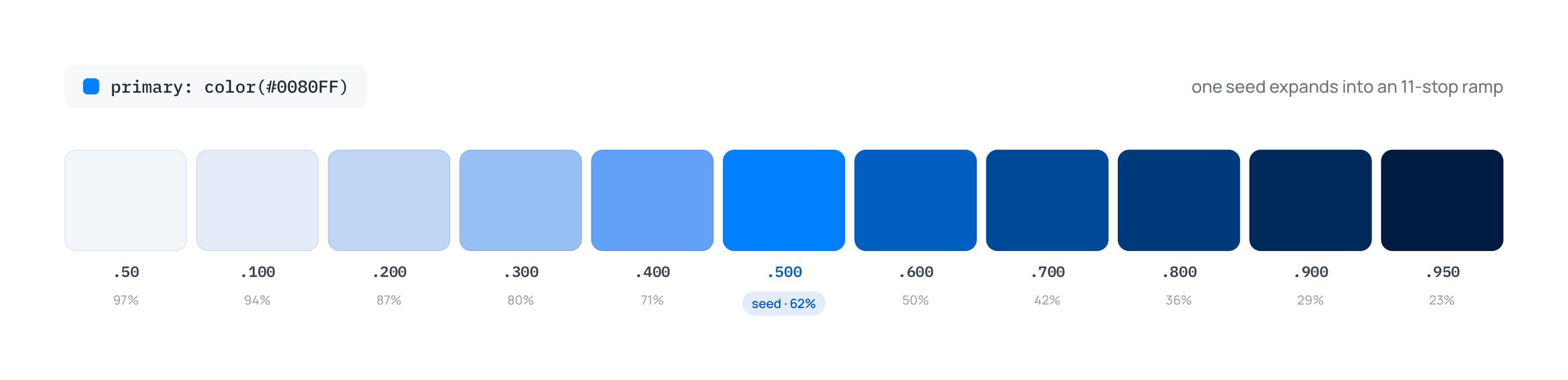
Color tokens come from seeds. A seed is a single hex or OKLCH literal that, wrapped in color(...), the resolver expands into an 11-step ramp via the OKLCH color space:
red: color(oklch(63.7%, 0.237, 25.331))Generates the primitive stops: red.50, red.100, red.200, red.300, red.400, red.500, red.600, red.700, red.800, red.900, red.950. The seed value IS the .500 stop.
Here is the default primary seed (#0080FF) expanded into its actual generated ramp:
Without color(...), the assignment is a single-value primitive (no ramp): red: #0080FF gives you $red only.
Primitive palette stops are fixed values, not mode-aware tones. $neutral.50 is always near-white in every mode; $neutral.950 is always near-black. If you want a color that flips with mode, wrap the primitive in boldness(...) to get the semantic, mode-aware role names.
Lightness scale
| Stop | Approx lightness | Typical use |
|---|---|---|
.50 | 97% | Subtle backgrounds |
.100 | 94% | Light backgrounds |
.200 | 87% | Hover states |
.300 | 80% | Borders |
.400 | 71% | Muted elements |
.500 | 62% | Primary (the seed) |
.600 | 50% | Hover on primary |
.700 | 42% | Active states |
.800 | 36% | Dark accents |
.900 | 29% | Very dark |
.950 | 23% | Darkest accents |
Lower numbers = lighter. Higher numbers = darker.
Semantic role names (boldness)
Wrap a color(...) primitive in boldness(...) to expose mode-aware role names. The 9 boldness stops map to OKLCH lightness stops:
| Role | Maps to | In light mode | In dark mode |
|---|---|---|---|
hint | .50 | very light | very dark |
faint | .100 | light | dark |
subtle | .200 | hover light | hover dark |
soft | .300 | border light | border dark |
mid | .500 | the seed | the seed |
firm | .600 | hover dark | hover light |
bold | .700 | active dark | active light |
strong | .800 | dark accent | light accent |
intense | .900 | very dark | very light |
boldness(color(...)) carries a theme.dark: mirror transform by default, reflecting low↔high (hint ↔ intense, faint ↔ strong, etc.) so the same role name reads correctly across themes (it also gets accessibility.high-contrast: outward(1) by default). You don't write these in the seed; they're the generator's defaults. Override them with an explicit transforms: { ... } arg, or opt out with transforms: none.
Here are the nine roles of the default primary seed, resolved by the engine in each theme:
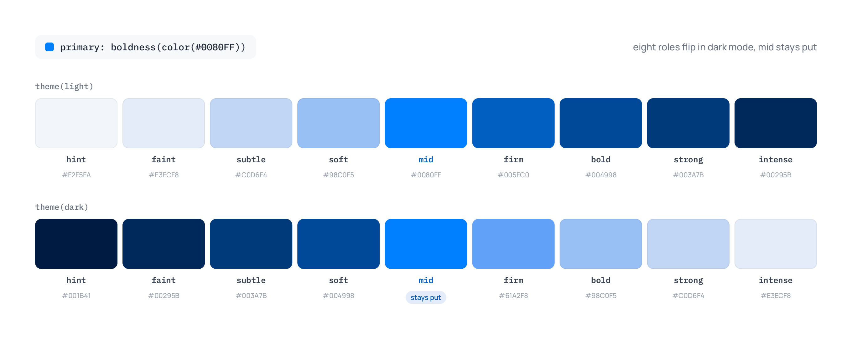
The .400 and .950 primitive stops carry no role name at all: the boldness mirror reflects over the nine role stops only, so in dark mode hint lands on .900 and firm on .300, never on .400 or .950. Those two stops stay reachable only as raw primitive references.
What ships in the seed template
| Category | Names |
|---|---|
| Brand slots | primary, secondary, tertiary, quaternary (defaults #0080FF / #FF3377 / #FF9900 / #FFDD00, the Brilliant logo palette). Hue-agnostic role slots, not named for what they are. |
| Neutral | neutral (default oklch(55.6%, 0, 0)) |
| Tailwind v4 palettes (21) | red, orange, amber, yellow, lime, green, emerald, teal, cyan, sky, blue, indigo, violet, purple, fuchsia, pink, rose, slate, gray, zinc, stone |
Each Tailwind palette is declared as an OKLCH literal matching Tailwind v4's source-of-truth, then wrapped in boldness(color(...)):
red: boldness(color(oklch(63.7%, 0.237, 25.331)))This gives you both the primitive ramp (red.50..950) and the boldness roles (red.hint..intense).
Chrome aliases
The seed template ships with a set of chrome aliases under color.*. These are semantic role names that point at the underlying palettes, and they're the names that show up in the inspector picker:
| Alias | Default reference | Use |
|---|---|---|
color.surface | neutral.hint | Page backgrounds |
color.surface.container | neutral.faint | Card / container backgrounds |
color.surface.container.high | neutral.subtle | Elevated surfaces |
color.surface.hover | neutral.faint | Hovered surface |
color.surface.pressed | neutral.subtle | Pressed surface |
color.surface.selected | primary.hint | Selected surface |
color.on-surface.selected | primary.bold | Content on a selected surface |
color.on-surface | neutral.strong | Text on surfaces |
color.outline | neutral.soft | Primary borders |
color.outline.variant | neutral.subtle | Subtle borders |
color.text.primary | neutral.bold | Body text |
color.text.secondary | neutral.firm | Secondary text |
color.text.disabled | neutral.soft | Disabled text |
color.text.display | primary.firm | Hero / title color |
color.text.display.alt | secondary.firm | Hero callout variant |
color.primary / on-primary / primary.container | primary.mid / neutral.50 / primary.hint | Primary role trio |
color.secondary / on-secondary / secondary.container | secondary.mid / neutral.50 / secondary.hint | Secondary role trio |
color.tertiary / on-tertiary / tertiary.container | tertiary.mid / neutral.50 / tertiary.hint | Tertiary role trio |
color.quaternary / on-quaternary / quaternary.container | quaternary.mid / neutral.900 / quaternary.hint | Quaternary role trio (dark text: yellow is too bright for white) |
color.success / on-success / success.container | green.mid / neutral.50 / green.hint | Success role trio |
color.error / on-error / error.container | red.mid / neutral.50 / red.hint | Error role trio |
color.warning / on-warning / warning.container | orange.mid / neutral.900 / orange.hint | Warning role trio |
color.info / on-info / info.container | blue.mid / neutral.50 / blue.hint | Info role trio |
color.shadow | neutral.950 | Default shadow cast (primitive, mode-immune) |
color.glow | neutral.50 | Default outer-glow color (primitive, mode-immune) |
Each alias is a single line. Refs to a boldness(color(...)) semantic inherit that semantic's mode-awareness; refs to a primitive stop are mode-immune.
color.shadow: neutral.950 always resolves to a near-black hex, in every mode, because neutral.950 is a fixed primitive stop. Compare to color.text.primary: neutral.bold, which mirrors to a near-white in dark mode because neutral.bold carries the theme.dark: mirror transform from its boldness(color(...)) seed.
Custom palettes
Add your own palette by declaring a new color seed with any name:
acme_blue:   boldness(color(oklch(60%, 0.21, 230)))
acme_orange: boldness(color(#FF6A00))Immediately produces acme_blue.50..950 (primitive stops) and acme_blue.hint..intense (mode-aware roles). References like color.cta: acme_blue.bold work normally.
Spacing tokens
The spacing declaration is an explicit list wrapped in tshirt(...) for semantic role names, with a none: 0 boundary stop:
spacing: tshirt(number([4, 8, 12, 16, 24, 32, 48, 64, 96, 128]),
min: { none: 0 })This produces both $spacing.1..32 (positions 1 through 10 are your explicit list values; 11 through 32 continue as base multiples) and $spacing.xs..6xl (t-shirt role names mapped to list positions, list[i] → role[i]), plus $spacing.none (0).
Like every number-backed scale (spacing, radius, font.size, font.weight, font.lineHeight, font.letterSpacing, stroke.width, visibility), spacing emits no bare token: always name a stop ($spacing.md, never $spacing). Only color seeds and font.family get a bare form.
| T-shirt stop | Default value |
|---|---|
spacing.none | 0 |
spacing.xs | 4 |
spacing.sm | 8 |
spacing.md | 12 |
spacing.lg | 16 |
spacing.xl | 24 |
spacing.2xl | 32 |
spacing.3xl | 48 |
spacing.4xl | 64 |
spacing.5xl | 96 |
spacing.6xl | 128 |
The seed template also ships negative overlap stops for pulling auto-layout children together (avatar stacks, badges biting into a card corner):
spacing.overlap.xs:  -2
spacing.overlap.sm:  -4
spacing.overlap.md:  -8
spacing.overlap.lg:  -16
spacing.overlap.xl:  -24
spacing.overlap.2xl: -32Edit the list to rescale everything:
spacing: tshirt(number([8, 16, 24, ...])) // each stop scaled updensity.compact shifts the t-shirt mapping down a notch automatically (md → sm's old value, etc.). accessibility.large-text shifts up. (These are the tshirt(...) generator defaults.)
Radius tokens
T-shirt scale with boundary stops. Radius opts out of mode transforms (transforms: none) so corners don't change with density or accessibility modes:
radius: tshirt(number([2, 4, 6, 8, 12, 16, 20, 24, 32, 40, 48, 64, 96]),
               min: { none: 0 }, max: { full: 9999 },
transforms: none)| Token | Default value | Use |
|---|---|---|
radius.none | 0 | Sharp corners |
radius.xs | 2 | Subtle rounding |
radius.sm | 4 | Small (chips, badges) |
radius.md | 6 | Default (cards, buttons) |
radius.lg | 8 | Prominent rounding |
radius.xl | 12 | Larger rounding |
radius.2xl | 16 | Cards, panels |
radius.3xl | 20 | Extra-large |
radius.4xl | 24 | Hero containers |
radius.5xl | 32 | Big blobs |
radius.6xl | 40 | |
radius.7xl | 48 | |
radius.8xl | 64 | |
radius.9xl | 96 | |
radius.full | 9999 | Fully rounded (pills, circles) |
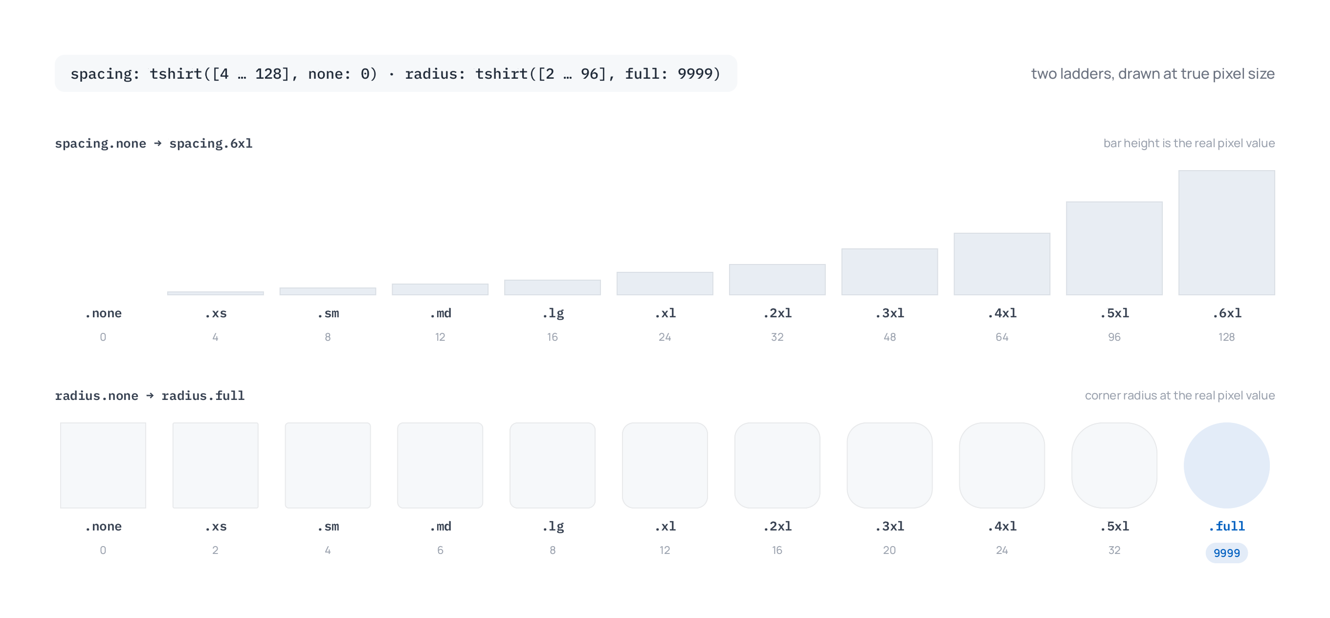
Both scales at their real pixel values:
Stroke width tokens
Boldness scale (uses the same 9-stop vocabulary as color tones):
stroke.width: boldness(number([0.5, 0.75, 1, 1.25, 1.5, 2, 2.5, 3, 4]),
                       min: { none: 0 },
max: { thick: 8, thicker: 16, thickest: 48 })| Token | Default value |
|---|---|
stroke.width.none | 0 |
stroke.width.hint | 0.5 |
stroke.width.faint | 0.75 |
stroke.width.subtle | 1 |
stroke.width.soft | 1.25 |
stroke.width.mid | 1.5 |
stroke.width.firm | 2 |
stroke.width.bold | 2.5 |
stroke.width.strong | 3 |
stroke.width.intense | 4 |
stroke.width.thick | 8 |
stroke.width.thicker | 16 |
stroke.width.thickest | 48 |
There's no bare $stroke.width form: number-backed scales emit no bare token, so always name a stop (e.g. $stroke.width.mid). A bare reference is flagged as a mistake.
st[(#000,w($stroke.width.soft))]).
Visibility tokens
Boldness scale of opacity-ish values:
visibility: boldness(number([0.05, 0.10, 0.20, 0.40, 0.50, 0.60, 0.80, 0.90, 0.95]),
                     min: { invisible: 0 },
max: { opaque: 1 })| Token | Default value |
|---|---|
visibility.invisible | 0 |
visibility.hint | 0.05 |
visibility.faint | 0.10 |
visibility.subtle | 0.20 |
visibility.soft | 0.40 |
visibility.mid | 0.50 |
visibility.firm | 0.60 |
visibility.bold | 0.80 |
visibility.strong | 0.90 |
visibility.intense | 0.95 |
visibility.opaque | 1 |
Use for layered transparency overlays, scrim opacity, gradient stops, etc.
Font size tokens
T-shirt scale, Tailwind-aligned:
font.size: tshirt(number([12, 14, 16, 20, 24, 32, 36, 40, 48, 64, 80, 96, 128]),
transforms: { accessibility.large-text: shift(+1) })The explicit transforms: overrides the t-shirt default (which would also shrink text under density.compact); only the large-text upshift is kept, since shrinking text by mode hurts readability.
| Token | Default value |
|---|---|
font.size.xs | 12 |
font.size.sm | 14 |
font.size.md | 16 |
font.size.lg | 20 |
font.size.xl | 24 |
font.size.2xl | 32 |
font.size.3xl | 36 |
font.size.4xl | 40 |
font.size.5xl | 48 |
font.size.6xl | 64 |
font.size.7xl | 80 |
font.size.8xl | 96 |
font.size.9xl | 128 |
md is the body-text size; everything else multiplies up or down from there in spirit. The seed also ships font.size.base as a 1.0x alias of md, so a token bound to base tracks whatever md resolves to.
Font weight tokens
Standard 9-step weight scale, exposed via boldness:
font.weight: boldness(number([100, 200, 300, 400, 500, 600, 700, 800, 900]))| Token | Value | CSS Equivalent |
|---|---|---|
font.weight.hint | 100 | Thin |
font.weight.faint | 200 | Extra Light |
font.weight.subtle | 300 | Light |
font.weight.soft | 400 | Normal |
font.weight.mid | 500 | Medium |
font.weight.firm | 600 | Semi Bold |
font.weight.bold | 700 | Bold |
font.weight.strong | 800 | Extra Bold |
font.weight.intense | 900 | Black |
There's no bare $font.weight form: number-backed scales emit no bare token, so always name a role stop (e.g. $font.weight.bold). A bare reference is flagged as a mistake.
Line height tokens
Looseness scale:
font.lineHeight: looseness(number([1.0, 1.25, 1.375, 1.5, 1.625, 2.0]))| Token | Value | Use |
|---|---|---|
font.lineHeight.none | 1.0 | Single-line, icons |
font.lineHeight.tight | 1.25 | Headings |
font.lineHeight.snug | 1.375 | Compact body |
font.lineHeight.normal | 1.5 | Body text |
font.lineHeight.relaxed | 1.625 | Comfortable reading |
font.lineHeight.loose | 2.0 | Double-spaced |
accessibility.large-text shifts mappings toward looser by one step.
Letter spacing tokens
Looseness scale:
font.letterSpacing: looseness(number([-0.05, -0.025, -0.0125, 0, 0.025, 0.1]))| Token | Value | Use |
|---|---|---|
font.letterSpacing.none | -0.05 | Very tight (display) |
font.letterSpacing.tight | -0.025 | Tight (headings) |
font.letterSpacing.snug | -0.0125 | Slightly tight |
font.letterSpacing.normal | 0 | Default |
font.letterSpacing.relaxed | 0.025 | Wide |
font.letterSpacing.loose | 0.1 | All-caps spacing |
Font family tokens
Three families ship by default:
font.family:        Manrope
font.family.serif:  "Noto Serif"
font.family.mono: monospaceAdd more with separate primitive declarations:
font.family.display: "Fraunces"Reference with the full dotted path ($font.family.mono). The font picker in the right toolbar sets fontFamily literally. To bind a family to a token, use a typography composite that has fontFamily set, or wire it through blueprint syntax.
Typography composites
The seed template ships these typography composites:
| Token | fontSize | fontWeight | lineHeight | |
|---|---|---|---|---|
typography.display.lg | font.size.6xl (64) | bold | 1.1 | |
typography.display.md | 52 | bold | 1.1 | |
typography.display.sm | 44 | bold | 1.15 | |
typography.h1 | font.size.3xl (36) | bold | 1.2 | |
typography.h2 | 30 | bold | 1.25 | |
typography.h3 | font.size.xl (24) | firm | 1.3 | |
typography.h4 | font.size.lg (20) | firm | 1.35 | |
typography.body.lg | 18 | soft | normal | |
typography.body.md | font.size.md (16) | soft | normal | |
typography.body.sm | font.size.sm (14) | soft | normal | |
typography.button | font.size.sm (14) | firm | tight | |
typography.input | font.size.md (16) | soft | 1.4 | |
typography.label | font.size.sm (14) | mid | 1.4 | |
typography.caption | font.size.xs (12) | soft | 1.4 | |
typography.code | font.size.sm (14) | soft | normal (monospace family) | |
typography.editorial.lg / .md / .sm | same scale as display | bold | matched | Serif (Noto Serif) variants for editorial headlines |
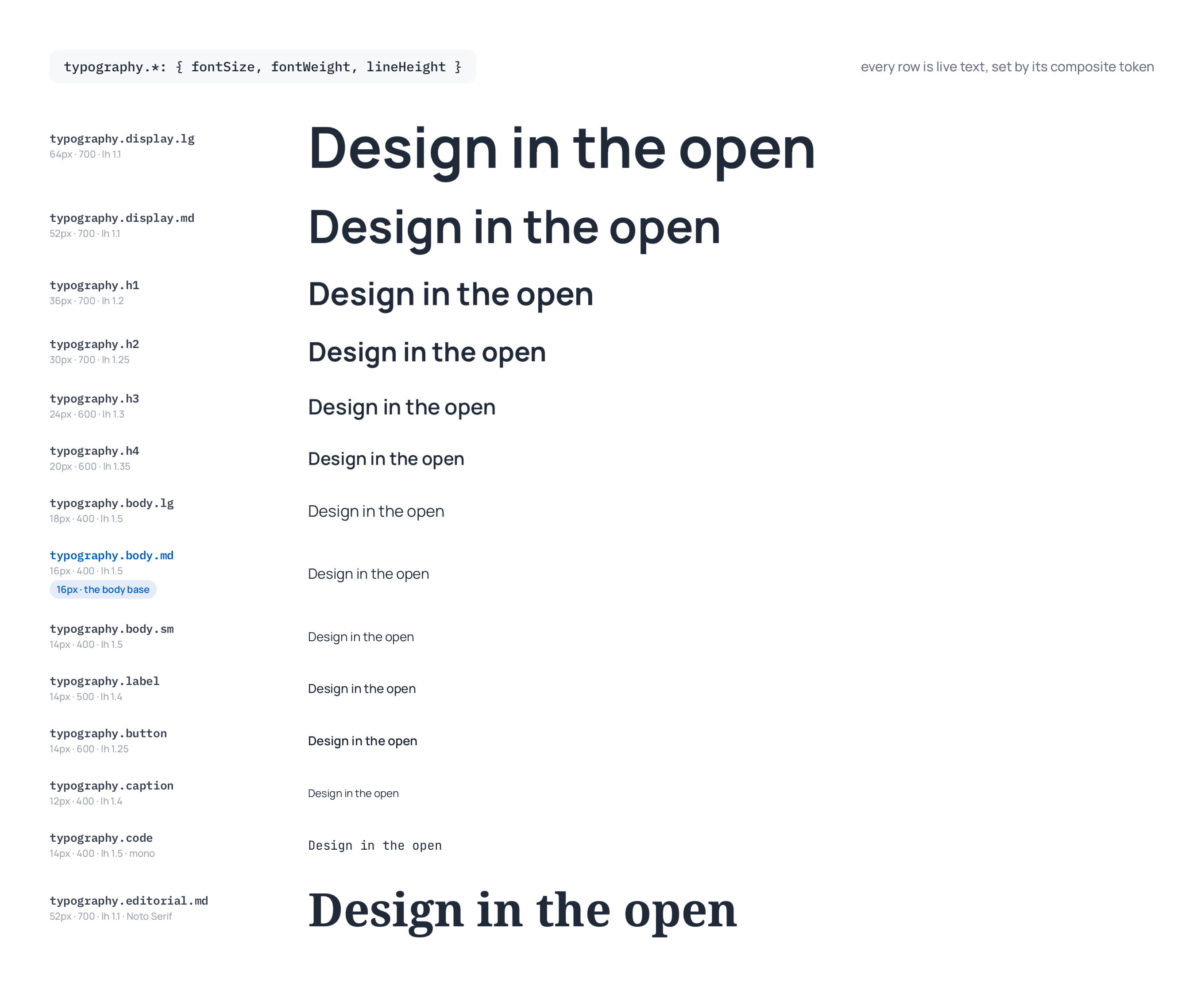
To apply a composite, ask the agent in the chat ("set the selected text to typography.h1"). It sets fontSize, fontWeight, fontFamily, lineHeight, and letterSpacing on the selected text in one go, and binds the composite typographyTokenRef (clearing any individual font-property token bindings). The text stays bound, so a token edit, a brand switch, or a mode switch re-applies the composite. Change one of those properties by hand and the text detaches from the composite.
Shadow composites
Tailwind-aligned shadow elevations:
| Token | Layers (visual feel) |
|---|---|
shadow.2xs | y:1, blur:0, opacity:0.05 (almost imperceptible) |
shadow.xs | y:1, blur:1, opacity:0.05 (very subtle) |
shadow.sm | y:1, blur:2, opacity:0.05 (small lift) |
shadow.md | 2-layer, y:2/y:4 (default elevation) |
shadow.lg | 2-layer, y:4/y:10 (pronounced lift) |
shadow.xl | 2-layer, y:10/y:20 (floating) |
shadow.2xl | y:25, blur:50, opacity:0.25 (dramatic) |
shadow.inner | y:2, blur:4 (inset feel) |
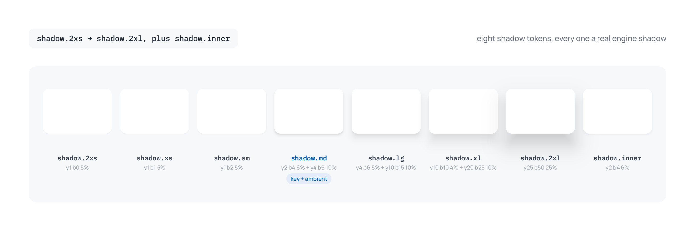
To apply one, ask the agent in the chat ("give the selected card shadow.md"). It replaces the element's existing drop shadows and keeps its inner shadows, glows, and blurs.
The canonical default.ds shape
The seed template's structure, condensed:
modes {
  theme:         [light, dark]
  density:       [comfortable, compact]
  accessibility: [standard, high-contrast, large-text]
}

// Brand and palette colors
primary:    boldness(color(#0080FF))
secondary:  boldness(color(#FF3377))
tertiary:   boldness(color(#FF9900))
quaternary: boldness(color(#FFDD00))
neutral:    boldness(color(oklch(55.6%, 0, 0)))
red:        boldness(color(oklch(63.7%, 0.237, 25.331)))
// ...21 Tailwind palettes total

// Geometry & motion
spacing:      tshirt(number([4, 8, 12, 16, 24, 32, 48, 64, 96, 128]),
                     min: { none: 0 })
radius:       tshirt(number([2, 4, 6, 8, 12, 16, 20, 24, 32, 40, 48, 64, 96]),
                     min: { none: 0 }, max: { full: 9999 },
                     transforms: none)
stroke.width: boldness(number([0.5, 0.75, 1, 1.25, 1.5, 2, 2.5, 3, 4]),
                       min: { none: 0 }, max: { thick: 8, thicker: 16, thickest: 48 })
visibility:   boldness(number([0.05, 0.10, 0.20, 0.40, 0.50, 0.60, 0.80, 0.90, 0.95]),
                       min: { invisible: 0 }, max: { opaque: 1 })

// Typography
font.family:        Manrope
font.family.serif:  "Noto Serif"
font.family.mono:   monospace
font.size:          tshirt(number([12, 14, 16, 20, 24, 32, 36, 40, 48, 64, 80, 96, 128]),
                          transforms: { accessibility.large-text: shift(+1) })
font.weight:        boldness(number([100, 200, 300, 400, 500, 600, 700, 800, 900]))
font.lineHeight:    looseness(number([1.0, 1.25, 1.375, 1.5, 1.625, 2.0]))
font.letterSpacing: looseness(number([-0.05, -0.025, -0.0125, 0, 0.025, 0.1]))

// Chrome aliases (semantic role names pointing at resolver outputs)
color.surface:                neutral.hint
color.surface.container:      neutral.faint
color.surface.container.high: neutral.subtle
color.on-surface:             neutral.strong
color.outline:                neutral.soft
color.outline.variant:        neutral.subtle
color.text.primary:           neutral.bold
color.text.secondary:         neutral.firm
color.text.disabled:          neutral.soft
color.text.display:           primary.firm
color.text.display.alt:       secondary.firm
color.primary:                primary.mid
color.on-primary:             neutral.50      // primitive ref → mode-immune
color.primary.container:      primary.hint
// (mirror for secondary, tertiary, quaternary, success, error, warning, info)
color.shadow:                 neutral.950
color.glow: neutral.50What's not built in
A few token types you might expect but Brilliant doesn't ship:
Animation tokens (duration, easing). Not yet. Could be added as user-defined primitives later.
Numeric tokens with units. Numbers are stored as plain doubles. No px/rem/em/% unit system.
Everything else is a custom token away. Pick a name, add it to your Styles/default.ds, and reference it.