Color and fills
Color in Brilliant runs through one control: the color picker. Learn it once and you can paint a solid, build a gradient, drop in an image, or reach for a shader, all from the same place. This page is a guided tour of the picker, top to bottom, followed by a tour of every fill type.
Where color lives
With something selected, the right toolbar shows up to three color sections:
Fills paint the inside of an element. Add one with ⇧F, remove one with ⌥F.
Strokes paint its outline. See Strokes and effects.
Selection colors appears when you select several elements: it gathers every color they use so you can recolor them all at once.
Each row in these sections starts with a small color rectangle on its left. That rectangle is the button that opens the picker.
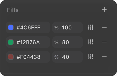
Opening the picker
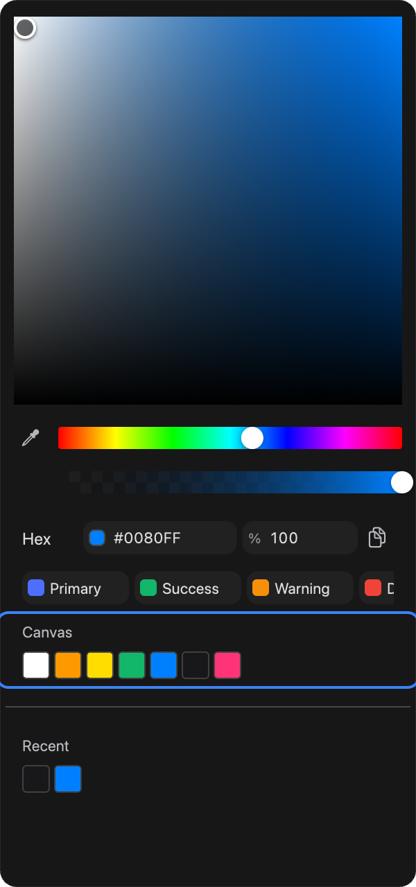
Click the color rectangle on any fill or stroke row to open the picker. (You can also toggle it from the keyboard with ⌃C.) The picker opens as a panel anchored to the right toolbar, and everything about that color is now one place.
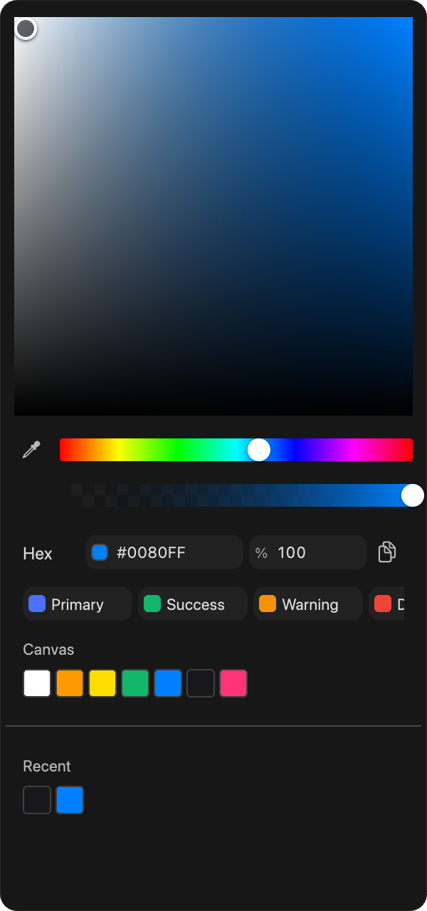
We will walk it top to bottom.
Step 1: The saturation and brightness square
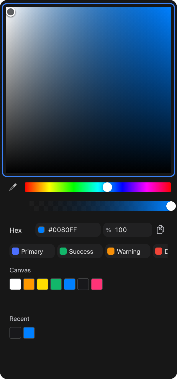
The big square at the top is where you pick the shade. Drag the crosshair: left and right changes saturation, up and down changes brightness. It always shows the current hue, so this is where you dial a color from washed-out to vivid, from dark to light.
Step 2: The hue slider
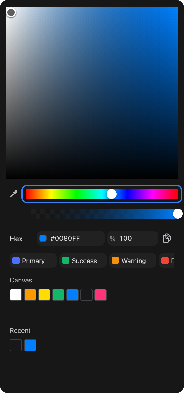
The rainbow slider below the square sets the base hue. Slide it and the square repaints to that hue, so the usual rhythm is: pick a hue here, then refine the shade in the square above.
Step 3: The eyedropper
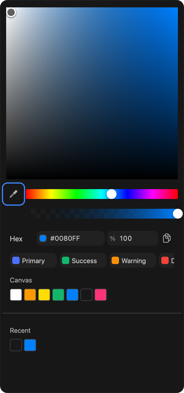
The eyedropper sits at the left end of the hue row. Click it, then click anywhere on the canvas to sample that exact color into the current fill. It is the fastest way to match a color you can already see. The shortcut is ⌃⇧C.
Step 4: The opacity slider
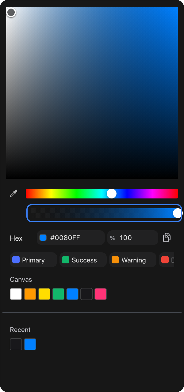
The next slider sets the paint's opacity, from fully transparent to fully solid. This fades just this fill or stroke, separately from the element's overall opacity.
Step 5: The format field
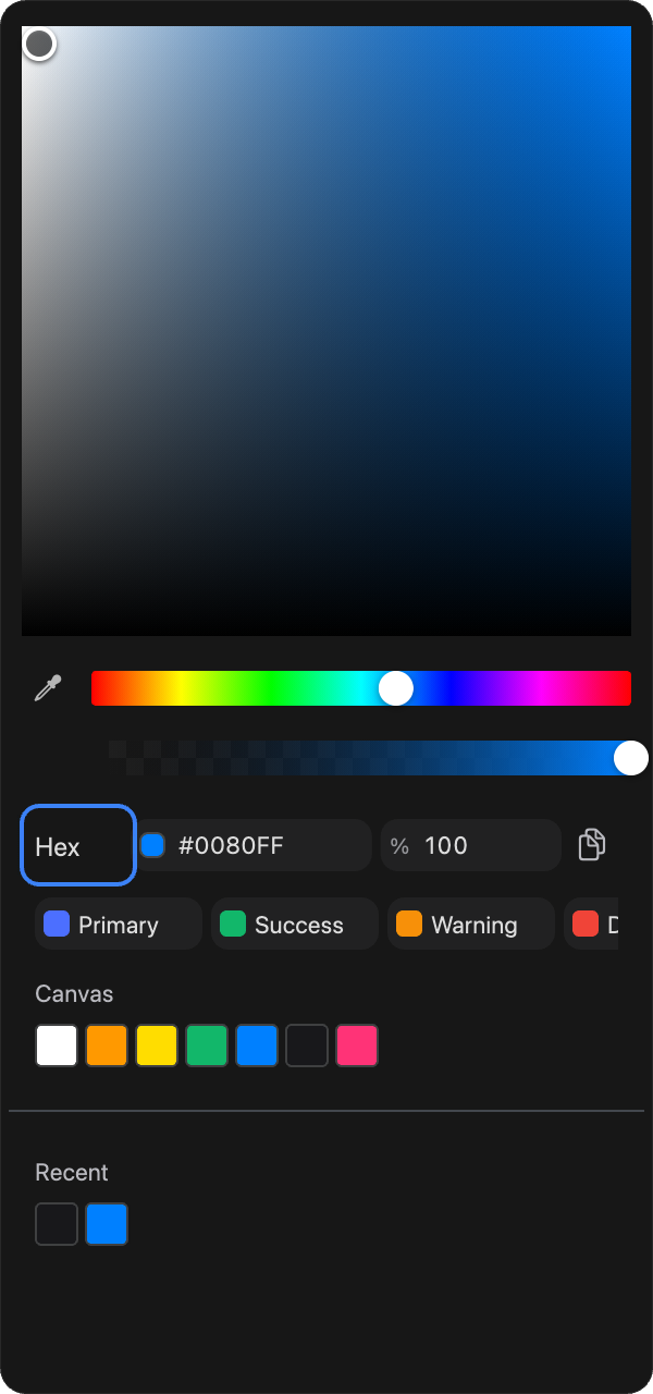
Below the sliders is the value field with a format dropdown. Switch between Hex, RGB, HSB, and CSS, then type a value directly, or copy the current one out with the copy button. If you have a color code from a spec or a brand guide, this is where you paste it.
Step 6: Design tokens
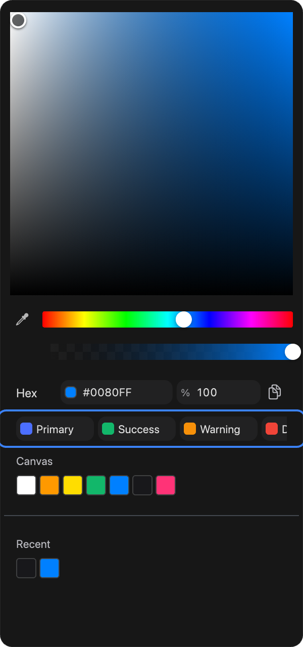
If your document has a design system with color tokens, they appear as a strip of swatches here. Click one to bind this fill to that token, so it updates everywhere when the token changes. This strip is only present when the document actually defines color tokens. More in the design system docs.
Step 7: Canvas and recent colors
At the bottom, two sets of swatches keep colors close at hand. Canvas gathers the colors already used on the current canvas, so your design stays consistent. Recent holds up to the last two dozen colors you picked. Click any swatch to apply it.
Fill types
A fill does not have to be a flat color. Use the type dropdown at the top of a fill row to change what kind of paint it is, and the picker reflows to match.
Solid: one flat color.
Gradients: a blend between color stops. Brilliant offers linear, radial, and angular gradients. Add and drag stops right in the picker, and reposition the gradient with its on-canvas handles.
Image: drop in a photo or graphic as the fill, with controls to scale, fit, or tile it.
Shaders: animated and interactive procedural fills, including Metaballs, Liquid Metal, Iridescent, Liquid Stainless Steel, Dithering, and a Reactive Grid.
Filters: effects that transform what is behind or beneath the fill, including Color Adjust, Noise, Halftone, Pixelate, Duotone, Posterize, and Dither.
Glass and static effects: Liquid Glass for a refractive surface, plus inner shadow, inner glow, and background blur, which are added as fills so they can sit anywhere in the fill stack. See Strokes and effects.
Because these are all fills, you can stack several on one element and reorder them: a solid base, a gradient overlay, and a grain filter on top, for example.
Handy shortcuts
Swap an element's fill and stroke: ⇧X.
Add a stroke: ⇧S. Remove one: ⌥S.
Next
Strokes, shadows, and glows: Strokes and effects.
Bind colors to tokens: Design system.