Frames and auto layout
Frames are how you structure a design in Brilliant: they hold elements, clip them, and drive auto layout. This page covers frames versus groups, the auto layout controls, the three sizing modes, layout grids, and masks.
Frame versus group
Both a frame and a group contain other elements, but they behave differently.
A frame is a real container. It can be any size, it clips its contents when you ask it to, it can run auto layout, and you can drag elements in and out of it on the canvas.
A group is a lightweight bundle. It always hugs its contents, you cannot drag elements out of it on the canvas (reach them through the layers list instead), and it has no layout or clipping of its own. It exists to move and transform a set of elements as one.
Groups and frames are not a one-way door. If you give a group a fixed or fill size on either axis, Brilliant promotes it to a frame automatically, since only frames can be sized independently of their contents.
Create them from a selection:
Frame the selection: ⌘F.
Group: ⌘G.
Ungroup: ⌘⇧G.
Or draw an empty frame with the Frame tool (F).
Auto layout
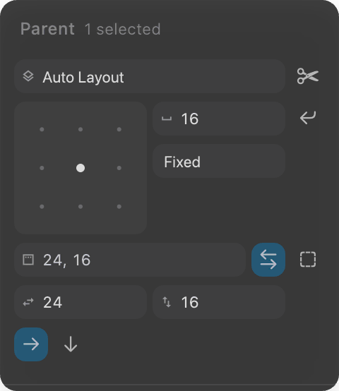
Auto layout turns a frame into a self-arranging stack: add, remove, or resize a child and the frame reflows. Add it to a selection with ⇧A, then tune it in the right toolbar.
Direction: stack children horizontally or vertically.
Spacing: the gap between children (defaults to 10). Set it to a number for a fixed gap, or switch to auto spacing to push children to the edges (equivalent to space-between).
Padding: the inset between the frame edge and its children, per side (defaults to 10).
Alignment: where children sit along the stack (start, center, end) and across it (start, center, end).
Wrap: let children flow onto a new line when they run out of room along the main axis.
The controls below drive a real frame on the actual engine: flip its direction, gap, padding, and alignment, and the tiles reflow in place, right here in the page.
Sizing: hug, fill, fixed
Every element in an auto layout frame has a sizing mode for each axis, and the frame itself does too.
Hug: shrink to fit the contents.
Fill: grow to fill the available space in the parent.
Fixed: stay at an explicit width or height.
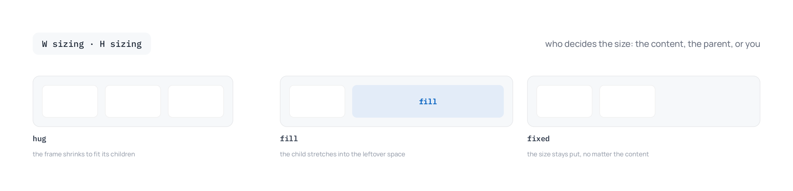
When several children are set to fill along the same axis, they share the leftover space. Give one a higher grow factor and it takes a proportionally larger share.
Need one child to sit outside the flow, pinned wherever you drag it? Turn on its ignore-auto-layout option (labeled Toggle Ignore Auto Layout), and the frame stops counting it for spacing and sizing while keeping it as a child.
Clip content
By default a frame lets its children spill past its edges. Toggle clip content (the scissors control next to the frame type) to crop anything that extends beyond the frame bounds. This is what turns a frame into a window onto a larger design.
Layout grids
Layout grids are on-canvas guides for lining work up: columns, rows, or a uniform square grid. Add one from the layout guides section of the right toolbar, then set its count, size, gutter, and margin. Grids are guides only, so they never export or affect your elements. Show or hide every grid on the canvas with ⇧G.
Masks
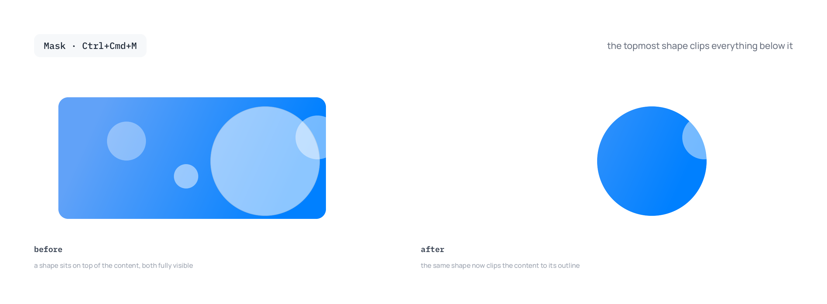
A mask clips a set of elements to the shape of one of them. Select two or more elements and press ⌘⌃M (or right-click and choose Use as Mask). The topmost element becomes the clip shape, and everything below it shows only where the two overlap. Masks are live: edit the mask shape or the masked content any time, and the result updates.
Next
Fill and stroke your frames: Color and fills.
Turn a frame into a reusable piece: see components in the design system docs.