Design tutorials
Two end-to-end walkthroughs you can follow prompt by prompt. The first builds a landing hero and refines it by talking to the agent. The second builds a dashboard card wired to your design system, so a single brand switch re-skins it.
Both use the built-in chat. It runs on Brilliant AI by default, so you can follow along without connecting anything; to use your own AI instead, see Connect an AI Provider. Everything the agent makes lands as native, editable elements, so you can keep nudging it by hand at any point.
Tutorial 1: A landing hero, prompt by prompt
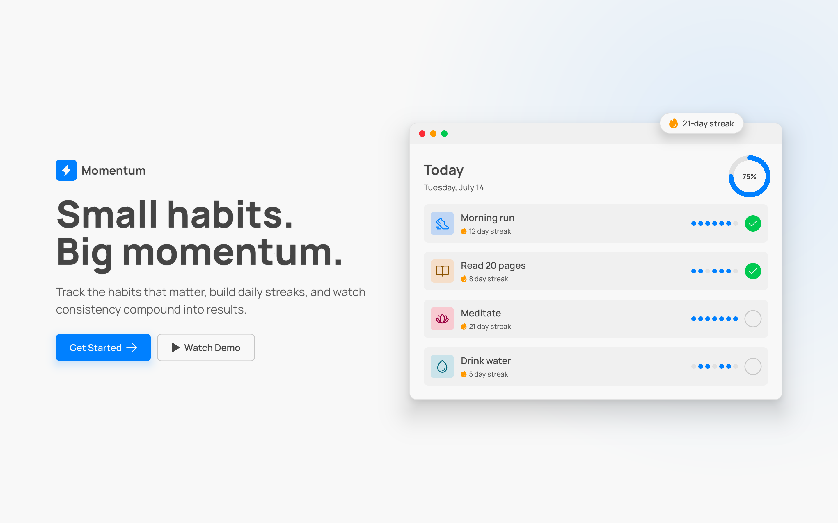
The goal: a hero section with a headline, supporting copy, two buttons, and space for a product shot. You'll prompt it into existence, then shape it with follow-ups.
1. Open the chat and describe the outcome
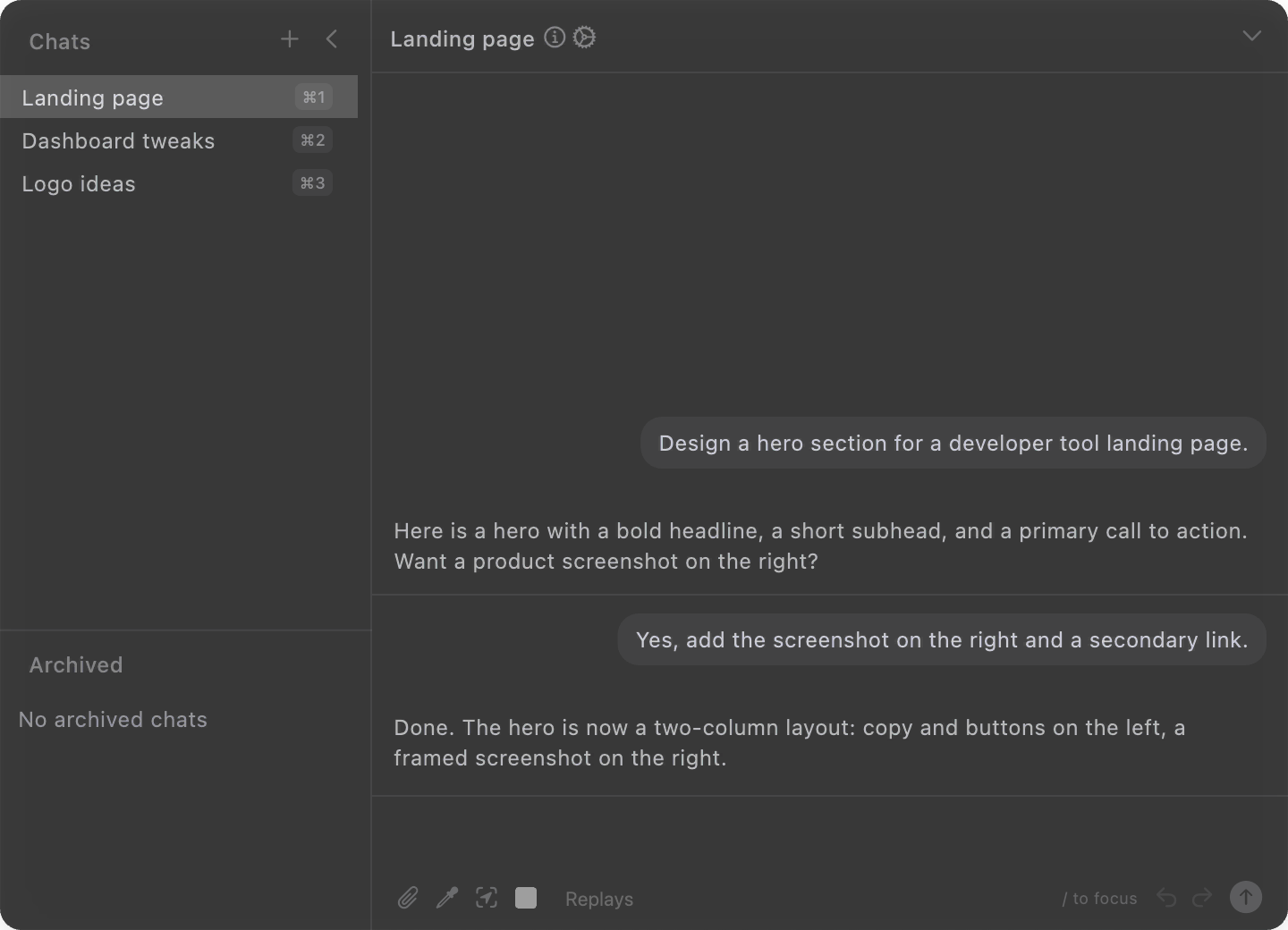
Press / anywhere on the canvas to focus the AI input, or click it in the bottom toolbar. Then describe what you want in plain language. Don't spell out steps or tools, just the result.

Send this with Enter:
Create a landing page hero for a habit-tracking app called Momentum. A big headline, one line of supporting copy, a primary "Get Started" button and a secondary "Watch Demo" button, and room for a product screenshot on the right.
The agent builds the hero as it goes, streaming each piece onto the canvas so you can watch the layout come together. When it finishes you have a real frame with real text and button elements, not a flattened picture.
2. Refine the copy
Follow-ups see the whole conversation and the current canvas, so you can speak in deltas instead of re-describing the hero:
Rewrite the headline to be punchier and under six words.
Make the supporting line more concrete: mention daily streaks.
Each message edits the same elements in place. Nothing gets recreated from scratch.
3. Adjust spacing and layout
Same idea, now for structure:
Add more breathing room between the headline and the buttons.
Center the whole hero and give it a bit more top padding.
4. Select an element, then talk about "this"
The agent reads your current selection, so you rarely have to name things. Click the primary button on the canvas to select it, focus the chat, and say:
Make this button a warmer orange and give it a subtle shadow.
Because the button is selected, "this" is unambiguous. The change applies to exactly what you picked. This works for a single element, a multi-selection, or a whole frame.
5. Reference other elements by name
When you want to point at something you don't have selected, type @ and pick it from the list. Mentions attach the element's structure and a render to your message, so the agent can match against it:
Match the secondary button's corner radius and height to @Get Started.
You can mention more than one element in a prompt to compose them, like pulling one element's styling onto another. Mentions cover elements, not whole canvases or files.
6. Branch off to try a variation
Happy with the hero but want to explore a bolder direction without losing it? With the chat focused, press ⌘N to start a fresh chat, then prompt the alternate take there. Old chats stay live, so you can jump between parallel experiments. Each chat also keeps its own undo, and any turn you don't like has a Revert control on its card that rolls back just that turn's changes. More on running several chats at once in Sessions and chat.
Tutorial 2: A dashboard card that re-skins with your brand
This one leans on your design system. Every fresh project ships with a fully populated set of tokens (colors, spacing, radius, type), so the payoff here is real: build the card once bound to those tokens, and switching theme or brand restyles it everywhere at once. If tokens are new to you, skim the design system overview first.
1. Ask for the card, bound to tokens
Focus the chat and describe the card, and explicitly ask it to use your design system:
Build a dashboard stat card: a small label, a big metric number, a trend indicator, and a sparkline area below. Use my design system tokens for the colors, spacing, corner radius, and type so it stays on-brand.
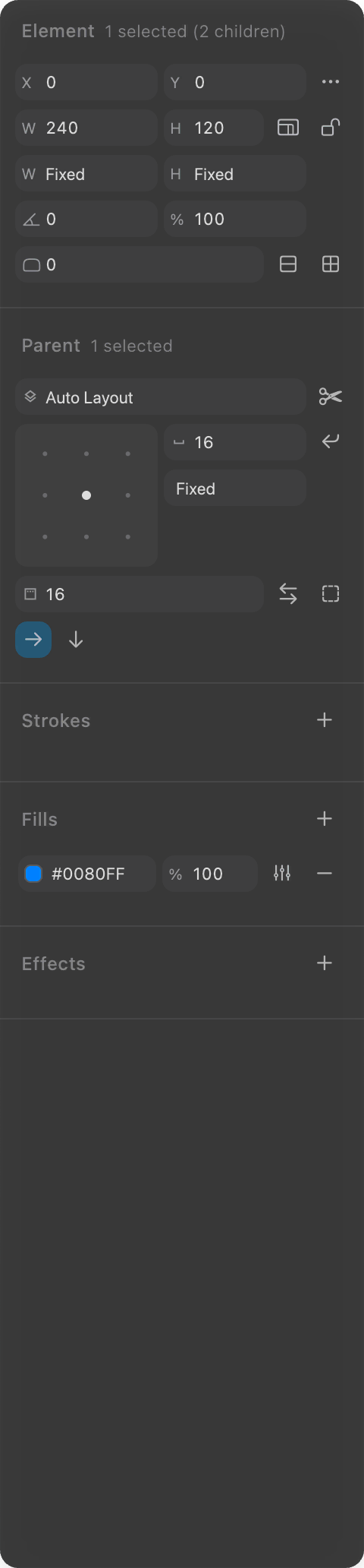
The agent has your token catalog in context, so it paints surfaces with roles like color.surface and text with color.text.primary, sizes gaps with spacing tokens, and rounds corners with radius tokens instead of hard-coded values. The result looks the same as hand-picked colors, but each property is bound to a named decision. The full catalog of what's available is in Tokens.
2. Multiply it, still on tokens
Ask for a row and the spacing stays token-driven:
Add two more of these cards in a row with equal spacing between them.
Because the gaps reference the same spacing token, they all move together the day you rescale your spacing.
3. Switch theme and watch it re-skin
Here's the point of binding to tokens. With nothing selected, open the Design system section at the top of the right toolbar and switch the theme dropdown from light to dark. Every card follows instantly: surfaces darken, text lightens, and the accent tones flip, because each property resolves through a token rather than a fixed hex.
You didn't touch the cards. The tokens did the work.
4. Switch brands, or spin up a new one
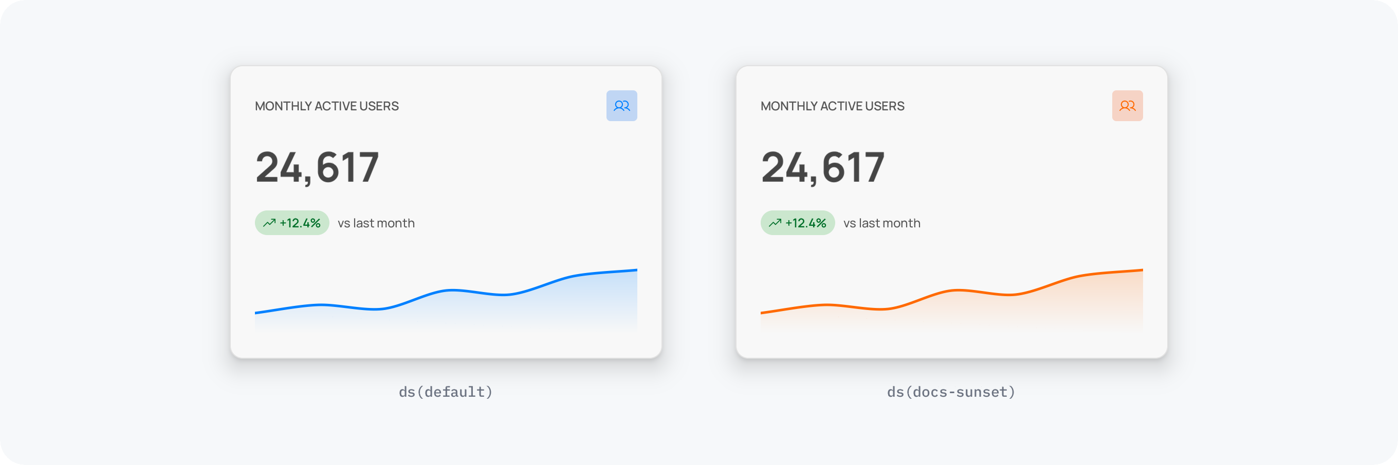
Brands work the same way. A brand is a sparse overlay: a different seed color and a few overrides, with everything else inherited. If your project already defines brands, pick another from the brand dropdown in that same Design system section and the whole row re-skins.
Don't have a second brand yet? Ask the agent to make one:
Add an alternate brand called "sunset" with a warm orange primary, and switch this canvas to it.
It writes a brand file into your project's Styles/ folder and flips the canvas over to it. Swap back to default any time from the brand dropdown. The mechanics of overlays, modes, and how the cascade resolves are in Modes & Brands.
Where to go next
The full range of what the agent can do: What the AI can do.
Run several chats in parallel and revert turns: Sessions and chat.
Go deeper on tokens, modes, and brands: Tokens and Modes & Brands.