In Brilliant, a design system is a short program
 Amichai Mantinband8 min read
Most design-token systems are a spreadsheet wearing a trench coat. A giant table of names mapped to hex values, a second table for dark mode, a third for the "compact" density someone asked for once, and a maintainer whose job is keeping all three in sync by hand. It works right up until you change your brand color, at which point you get to do it forty times.
We wanted something else. In Brilliant, a design system is a short program. You author a handful of lines in a small DSL, and a compiler turns them into every stop, every role, and every per-mode variant your designs will ever reference. Change one seed, and the whole thing re-derives. This post is a tour of how that works: the authoring file, the OKLCH color math underneath it, the semantic scales that name the outputs, and the piece we're proudest of, modes that are transforms rather than duplicated palettes.
A design system is a file
Every Brilliant project has a Styles/ folder with one file you actually edit: default.styles. It's plain text, it diffs cleanly in git, and it carries the entire design system for the project. Here's the top of the one we ship by default:
modes {
  theme:         [light, dark]
  density:       [comfortable, compact]
  accessibility: [standard, high-contrast, large-text]
}

primary:    boldness(color(#0080FF))
secondary:  boldness(color(#FF3377))
tertiary:   boldness(color(#FF9900))
quaternary: boldness(color(#FFDD00))

neutral: boldness(color(oklch(55.6%, 0, 0)))Four brand colors, one neutral, and a declaration of which modes exist. That's a real, working fragment. From those five color lines, the compiler generates hundreds of tokens.
The reason it's a file and not a settings panel is the same reason Blueprint (our design DSL) is a language: text is the format both humans and agents are fluent in. An engineer can review a design-system change in a pull request. An AI agent can author a whole brand as a few override lines. And because elements never store resolved colors (they store token references like color.primary and re-resolve at paint time), one edit here ripples through every canvas that references it.
Source in, token table out
The .styles file is compiled before anything reaches the canvas: each seed expands into its full family of stops, the roles get named, and the per-mode behavior is baked in. Nothing in the design file is a value your elements copy. Elements hold live references, and they re-resolve per token and per mode at paint time.
OKLCH, and why generated scales need it
When you hand us #0080FF and ask for an eleven-step ramp from near-white to near-black, the naive approach is to interpolate in sRGB. Don't. sRGB is perceptually lopsided: equal numeric steps produce wildly unequal jumps in apparent lightness, and hues drift and muddy as you darken them. You get a ramp that looks even in a table and terrible on a screen.
So the compiler expands seeds into perceptually even OKLCH ramps. OKLCH is a cylindrical form of the Oklab color space, with three axes: L for perceptual lightness, C for chroma, and H for hue. Its defining property is that its lightness axis tracks how light a color actually looks to a human eye, so a ramp built on evenly spaced L values reads as evenly spaced.
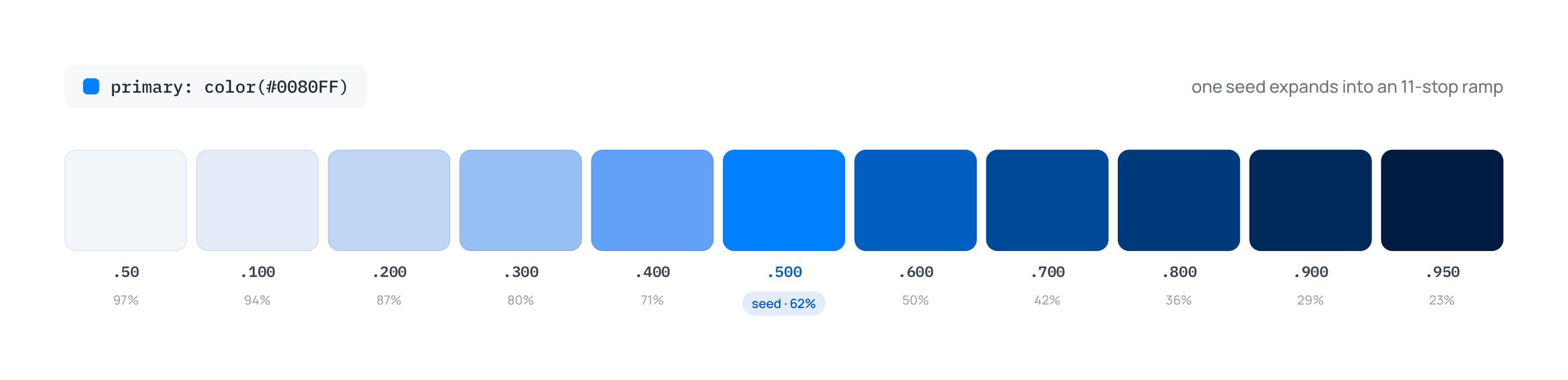
The ramp itself is eleven steps, numbered 50, 100, 200, ... 900, 950. Your seed IS the .500 stop, exactly, byte for byte. That convention is deliberate: it lines up with Tailwind v4's 500 stops, so a brand color you enter as its natural mid tone lands where you'd expect. The light end holds near white, and the dark end is lifted off pure black so the bottom three stops stay distinguishable from each other and from the void.
Here is the default primary seed expanded into its actual generated ramp:
There's one perceptual subtlety we handle for neutrals. Grays with almost no chroma want to be lifted lighter on the top half of the ramp than a saturated hue would (Tailwind hand-tunes its neutrals the same way), so near-achromatic seeds get an airier light half automatically. Our default neutral is oklch(55.6%, 0, 0): zero chroma, pure lightness, the workhorse behind nearly every surface and label.
Semantics: naming the stops
Raw stops like primary.500 are precise but anonymous. Nobody wants to remember that "the hover state should be step 200." So the generators wrap primitives in a semantic layer that maps role names to stops. There are three vocabularies, and they're used uniformly across every domain they touch.
Boldness is nine roles for anything with a low-to-high intensity: hint, faint, subtle, soft, mid, firm, bold, strong, intense. The center is mid. On a color scale, mid is step 500, so $primary bare resolves to primary.mid, the tone you seeded. Boldness drives color tone, font weight, stroke width, and opacity alike, so font.weight.bold and primary.bold speak the same language.
T-shirt sizing handles anything on a size ramp: spacing, radius, font size. The vocabulary runs xs, sm, md, lg on up through 20xl, because marketing layouts genuinely want section padding in the hundreds of pixels. Here's spacing and font size from the default file:
spacing:   tshirt(number([4, 8, 12, 16, 24, 32, 48, 64, 96, 128]),
                  min: { none: 0 })

font.size: tshirt(number([12, 14, 16, 20, 24, 32, 36, 40, 48, 64, 80, 96, 128]),
transforms: { accessibility.large-text: shift(+1) })Looseness is six roles for line height and letter spacing: none, tight, snug, normal, relaxed, loose.
On top of the generated roles sit plain aliases, the chrome layer you actually build interfaces from:
color.surface:      neutral.hint
color.on-surface:   neutral.strong
color.primary: primary.midA surface is a surface. Swap the brand seed and color.primary follows without anyone touching the alias.
Modes are transforms, not palettes
Here's the part we like. A second palette for dark mode is a maintenance tax and a lie: it claims your dark theme is a genuinely different set of decisions when almost always it's your light theme, reflected. So we don't store a second palette. We store a transform.
Each semantic generator carries an ordered list of (mode → operation) transforms. At resolve time, the resolver starts at a role's base stop index and applies every operation whose mode is currently active. Three operations exist:
shift(N)moves N stops along the scale, and multiple active shifts sum.mirrorreflects the index around the middle stop. This is how dark mode flips a color:primary.hint(near white in light) mirrors to a near-dark stop in dark, while the center stays put.outward(N)pushes N stops away from center toward the nearer end. Darks get darker, lights get lighter. This is high-contrast mode.
Generators come with sensible defaults, so you rarely write transforms by hand. A boldness(color(...)) seed defaults to theme.dark: mirror plus accessibility.high-contrast: outward(1). A tshirt scale defaults to density.compact: shift(-1) and accessibility.large-text: shift(+1), so compact density quietly tightens every spacing and radius by one stop while large-text loosens it. You override a generator's transforms explicitly when you want to (font size above opts out of the compact shrink, because shrinking text for density is a readability regression), or opt out entirely with transforms: none, which is exactly what radius does.
The mirror in action, resolved by the real engine in each theme:
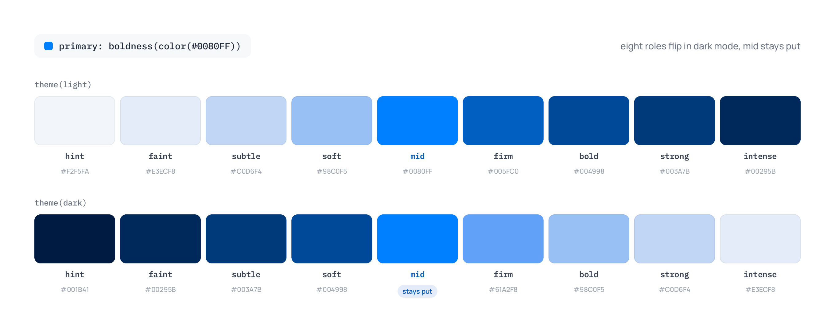
The payoff is that a mode switch is an index-shift program over one palette, not a lookup into a second one. Add a brand and you inherit all of this for free; the brand file is a few seed overrides and every mode keeps working. And because resolution is per token and per mode, a single element can even carry its own mode overrides against the same shared scales.
Composite tokens
Some decisions are bigger than one value. A heading is a size, a weight, and a line height together; a believable shadow is several layered drops. Those are composite tokens, and the DSL has first-class forms for both:
typography.h1: { fontSize: font.size.3xl, fontWeight: font.weight.bold, lineHeight: 1.2 }

shadow.md: [
  drop(y: 2, blur: 4, spread: -1, color: rgba(0, 0, 0, 0.06)),
  drop(y: 4, blur: 6, spread: -1, color: rgba(0, 0, 0, 0.10)),
]A typography token is a record of font fields; a shadow token is a list of drop(...) layers. Elements bind to them by reference, so editing shadow.md once restyles every card that uses it. Notice the shadow colors are absolute rather than token roles, and on purpose: a shadow should stay dark whether it falls on a light or dark surface. Point it at a brand role instead and it would cheerfully invert in dark mode and turn into a glowing halo.
Resolution at paint time
Tie it together and the whole system is lazy. Elements store token references, never resolved values. At paint time a render context carries the active canvas, the active modes (say {theme: dark, density: compact}), and an optional brand, and every token-bound property resolves through it. Flip a mode in the inspector, or edit one line in default.styles, and the change re-resolves through every binding at once, with no baked values to hunt down.
That's the whole pitch. A design system small enough to read in a sitting, color scales that are perceptually even because the math is done in the right space, and modes that are a few operations over a single palette instead of a pile of parallel tables you have to keep honest by hand.
If you want the full grammar, the authoring reference covers every generator and form, tokens walks the built-in defaults, and modes and brands goes deep on the transform vocabulary.